Usability Testing – UX/UI Design Process
The Challenge
The goal was to validate and improve the usability of a digital product by identifying pain points and areas of confusion in the user journey. The existing design needed real user feedback to enhance effectiveness and satisfaction.
The Process & Research
I planned and conducted usability testing sessions with target users, observing interactions and gathering qualitative insights. Analyzed the data to prioritize issues and propose actionable design improvements.
Selected Website for the Evaluation: https://emesweddings.com/
The website showcases stills and video wedding photography and also includes a section for clients to leave comments and impressions from their event day. Visually, the site is impressive. It succeeds in creating a luxurious and emotional atmosphere and conveys a message of high-end wedding photography. The images are large, the design is clean, and the style is consistent; together, they create an experience that captures users’ attention.
However, there are areas where the user experience is less clear. Some visitors may find it difficult to immediately understand where they are on the site, particularly what differentiates the various menu sections, what the offered service includes, what packages exist, and how the process with the studio works.
The site presents itself as a luxury wedding/event photography studio, with an emphasis on wedding photography. It features a rich photographic portfolio and offers both photography and video services. The primary goal of the website is to attract couples who are getting married and are interested in high-quality, professional, and premium photography services. The offering is presented through a brand-oriented marketing site that also includes testimonials and photo albums from previous weddings. The potential users are engaged couples, along with their families and friends who may be considering wedding-photography services; additionally, wedding vendors, designers, or event producers seeking potential collaborations may also visit the site.
The website serves as a presentational marketing tool, showcasing branding, experience, and style. Therefore, it is crucial that the interface be inviting, clear, and supportive of users’ emotional and practical decision-making—meaning appropriate imagery and styling, contact options, pricing, packages, and so on.
In conclusion, the site creates a professional visual impression, but the user experience can be improved by enhancing clarity, strengthening navigation, and presenting information more transparently. It is recommended to add indicators showing the user’s current page location (such as breadcrumbs), provide short explanations for each menu item, create a simple page outlining the workflow, make pricing or service-package information more accessible, and ensure easy navigation within galleries and wedding stories—including the ability to return seamlessly to the previous screen. In addition, the text-to-background contrast should be sufficient, and links and buttons should be clearly identifiable.
The site is beautifully designed, but with several adjustments it could become more user-friendly and easier to understand.
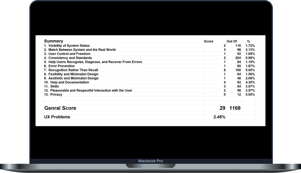
Heuristic Evaluation
Site Scoring Scale:
Severity Rating Definition
0 Promotes Usability
1 Cosmetic Problem Only – need not be fixed unlees extra time is availble on project
2 Minor Usability Problem – fixing this should be given low priority
3 Major Usability Problem – important to fix, so should be given high priority
4 Usability Catastrophe – imperative to fix this before product can be released
According to the Heuristics Evaluation, a small number of usability issues were identified; however, they remain important for the client. These adjustments could provide the company with added assurance from the client’s perspective.
Summary
The website is visually appealing, brand-oriented, and conveys a sense of luxury. It is particularly suitable for couples seeking an emotional experience.
However, the site lacks certain elements such as clarity, navigation, transparency, and control for users who are looking for more practical information, for example: a wider range of packages, workflow details, and more. It feels as if the information was either not fully detailed or is hidden from the user.
Recommendations for Improvement
- Add clearer navigation, for example, by emphasizing the menu or including breadcrumb trails.
- Include a page explaining the service process, with detailed steps for each offered “package” presented clearly. This can help create a sense of trust in the company and assure clients that there are “no surprises.”
- Add back/forward buttons for galleries and stories.
- Check accessibility compliance, such as text contrast, clear links, and other accessibility features.
- Consider a user retention feature, such as adding a Favorites / Save / Recently Viewed component.